The challenge of building sustainable revenue from membership websites while fostering community engagement is a critical one. A significant hurdle is the abundance of free content in combination with retaining your audience’s attention. There can be a real fear of investing time, energy, and resources into a site that ends up being unviable.
However, with the right design and strategy, membership websites offer a unique opportunity to create an exclusive environment and secure a steady income stream. Personalized content, community features, and direct engagement all become vital components to enhance the User Experience (UX).
In this post, we’ll dive deep into building a successful membership website. However, we won’t look at the actual process. Instead, we’ll explore the key components that make these platforms thrive. This includes understanding your audience, implementing engaging design elements, dissecting real-life membership websites, and much more.
How Membership Websites Differ From Other Recurring Payment Strategies
Membership and subscription models may seem similar at first glance, they both have distinct characteristics. At its core, a subscription model revolves around providing access to a product or service for a recurring fee.
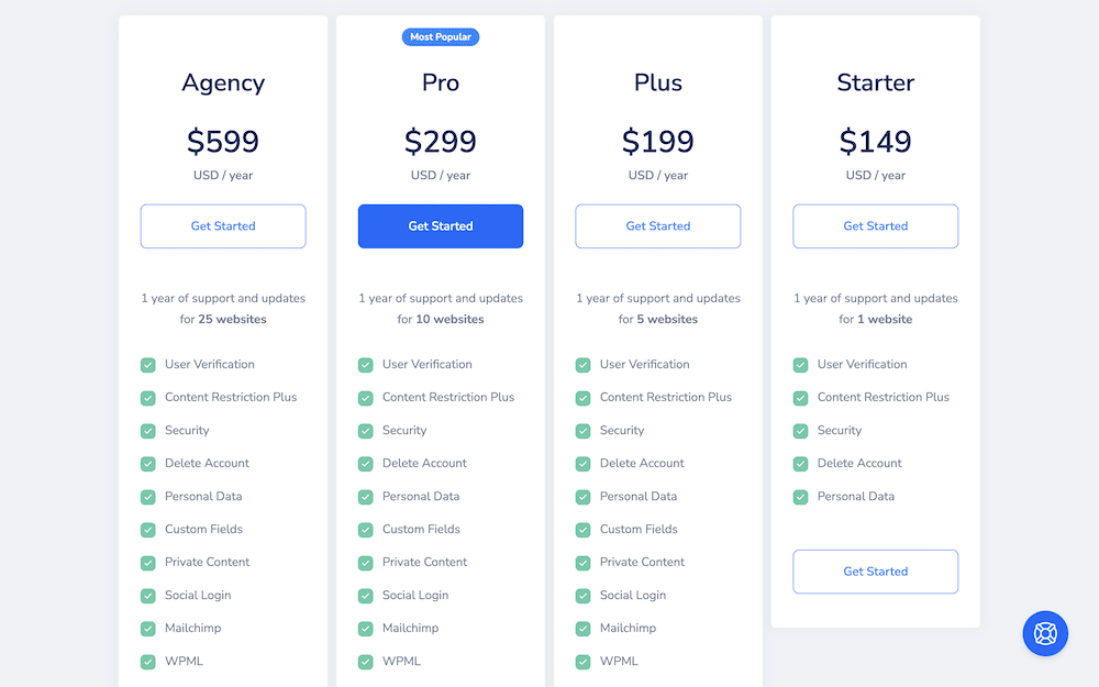
You’ll see this approach in Software as a Service (SaaS) platforms, streaming services, and digital publications. WordPress is one industry that uses the subscription pricing model often:
In contrast, membership websites introduce an additional layer of engagement. These platforms are not only about accessing content, but joining an exclusive community. Memberships often revolve around a specific niche or interest, and come with other perks too.
For instance, you could receive personalized and exclusive access content, and direct interaction with the content creator or community. We’ll have examples of membership websites and how they operate later.
In short, choosing a membership model over a subscription model depends on several factors. This includes the nature of the content, the target audience, and your own engagement strategy:
- Subscriptions offer a consistent and predictable experience, where users pay to access content or services. This is regardless of the level of personalization or community interaction the customer gets. They’re also easier to scale and manage in general.
- A membership model fosters a sense of belonging and identity among its members. This can require more effort to create content and manage the community.
The focus of this post isn’t to help you choose though. From here, we’re going to hone in on what makes for a good membership website, and help you understand the differences to build your own.
The Benefits of Running a Membership Website
There are plenty of unique advantages to running a membership website. Common with a subscription mode, a membership site’s financial predictability and stability lets you focus more on content quality than sales and marketing. This will be a boon for budgeting and forecasting, and can also transform the way you interact with your audience and build loyalty.

Get Started with the Best WordPress Membership Plugin Today
Connect, Manage and Build your Membership Site
However, there are unique benefits typical of membership websites you’ll want to understand too:
- Enhanced user engagement. Paying members will have greater investment in your site, which leads to better interaction, feedback, and participation. This strengthens member relationships, and encourages a vibrant community culture. The net result is a member list that feels valued and connected.
- Personalized content and experiences. Creating content that speaks to the specific interests and needs of your audience can enhance value. Exclusive articles, video content, webinars, or interactive forums all contribute to your engagement levels and UX.
- Feedback and development. You can net invaluable feedback and insights directly from your most engaged and qualified audience. This feedback loop improves your content, helps to identify trends, and highlights the needs of your members.
Overall, providing exclusive, high-quality content and fostering an engaged community will give you an uptick in brand loyalty and niche authority. In addition, the most loyal members could even become brand advocates to help attract new members. This organic growth enhances your brand’s reputation and credibility, and sets you apart from the competition.
The Core Functionality of a Membership Website (And How WP User Manager Can Help)
Your membership site has to include the right features and functionality to enable hassle-free signups. As such, there are a few core tenets of a membership website.
At its heart is a robust user registration and management system. This lets visitors sign up, create profiles, and become members. It’s the initiation of their journey within your community. Tools for tracking user activity, managing subscriptions, and providing support will all be essential.
WP User Manager includes various ways to sign up to a site, such as through on-site forms or social media logins:

Personalized member profiles will also let members connect, share, and engage in a deeper way. This is a fundamental part of WP User Manager, with lots of scope of managing those user profiles too.
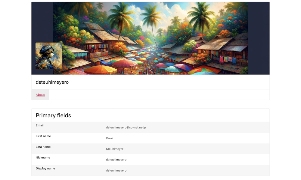
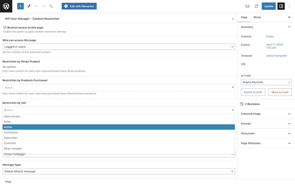
Without the proper access controls though, your site can’t segment users by membership tier. The typical approach is to set up paywalls, member-exclusive areas, or restricted content that offers premium articles, videos, webinars, and forums.
Within WP User Manager, you have access to a full-featured user role manager for creating your tiers. This combines with on-page content restriction controls based on role to give you a powerful way to organize content for each tier.
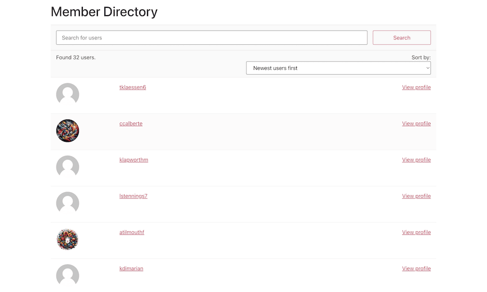
Forums, groups, member directories, comment sections, and social media integration all encourage engagement with both your site and each other. These interactive elements are often vital, and WP User Manager provides them with little to no customization required on your part:
This covers the core functionality, but what about other elements your site may need? Let’s discuss that in brief next.
Secondary Functionality for Your Site
Depending on your site, you may need further functionality. In some cases, this may be essential for you. In general though, not every membership website will need the following:
- Payment processing. If you don’t collect user data in order to access content, seamless payment processing will be vital. WP User Manager comes with Stripe support out of the box, which needs no technical knowledge to use.
- Multilingual functionality. The internet is a global medium, which means there are potential new members everywhere. You may want to sign up those who don’t speak your primary language, for which translation functionality should be a part of your setup.
- Analytics and reporting. Understanding the behavior and preferences of your members is a key to growth and improvement. The typical tools you’d use to track engagement, assess content performance, and identify trends can work here. This is where integrations with your chosen membership platform will be invaluable.
Of course, the exact blend of features and functionality will be unique to you. This is only a slice of what you could implement. Though, your pricing model should be a key factor in what each tier contains. Let’s take a quick look at a great way to draw new members in without risk on their end.
Including a Free Tier Alongside Your Premium Plans
A free membership option could be at the forefront of your strategy. They’re strategic ways to help you to increase numbers, and promote paid memberships.
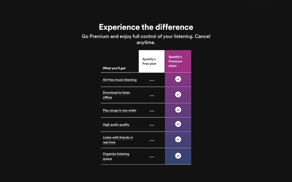
In fact, you have plenty of scope when it comes to different pricing models using a ‘free access’ tier:
- Freemium model. This popular approach offers a base level of content for free, and reserves more advanced features, content, or community access for paying members. For the end user, it’s a non-committal approach that can showcase the value of your premium content.
- Time-bound access. The ‘free trial’ model gives free access to certain parts of the site for a set period, after which they would need to subscribe to continue. If you update content on a regular basis, this model could be ideal.
- Tiered memberships. In this typical approach to memberships, the free tier serves as an entry-level offering. You’ll use several other paid tiers that progress in value. It gives members the choice to choose the right level for them.
You could tweak some of these pricing models to adapt to your own setup. For example, instead of giving out full access to your content as per the freemium model, you could offer a selection of sample content for free. This could include introductory courses, preview articles, or even community access.
However, regardless of your pricing model, you need the right design and layout to optimize signups and engagement. The next section looks at this in greater detail.
Membership Website Design: The Fundamentals
We’d argue that the ‘technical’ aspects of designing a membership website are more important than aesthetics, although both are crucial. Considering the journey from site visitor to engaged member should be your number one priority.
As such, there are some fundamental aspects to consider. For starters, your members should find it easy to locate relevant content, manage their accounts, and interact with the community. Well-structured navigation contributes to good UX and reduces bounce rates.
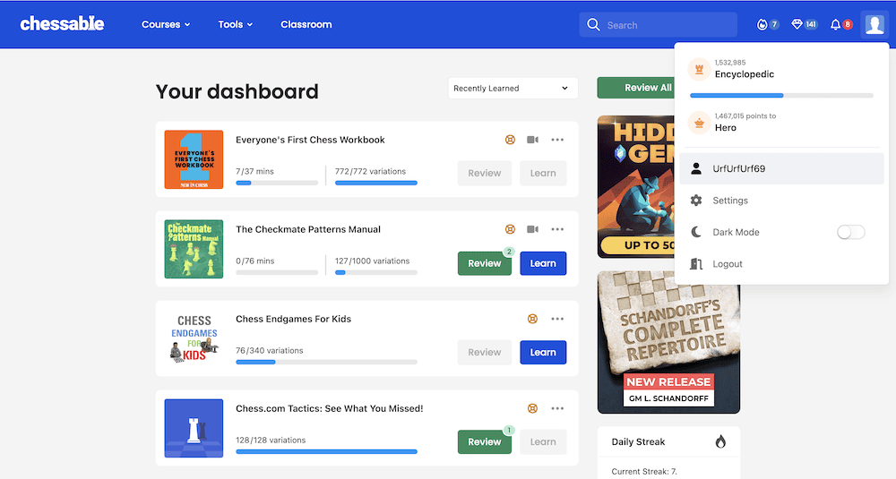
A Call To Action (CTA) can be an effective way to lead members around your site. You’ll want to use many of these. Anywhere you want someone to take a desired action, such as signing up, upgrading their membership, or engaging with content requires a CTA:
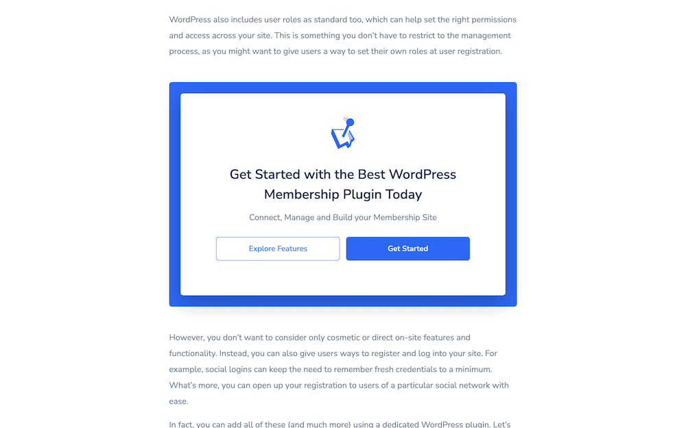
Creating CTAs could take a whole other article. However, in short, they should be visible, compelling, and specific. The goal is to convert visitors into signups, and encourage member interaction.
Social proof is also vital to stimulate signups. Testimonials, member stories, and social media shares will help to build trust and credibility:
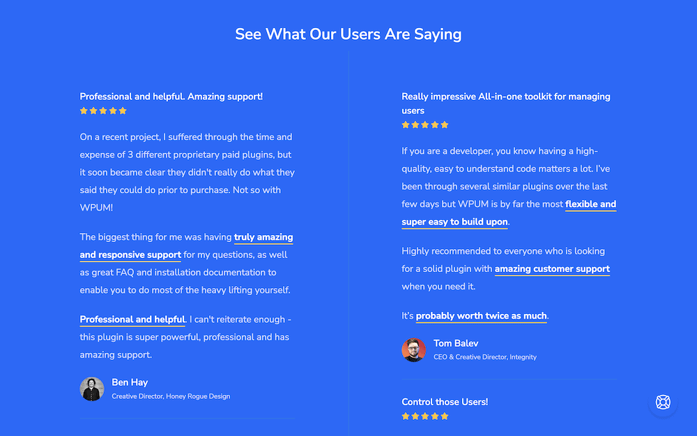
While you don’t want non-members to access premium content, you do want them to know it’s there waiting. This is where content teasing and locking comes into play. It creates curiosity, and demonstrates the value behind the paywall. In turn, it should prompt users to sign up to gain full access:

In order to understand how these elements lock together, let’s look at some real-world membership websites to see what they do well, and where you could improve your own site.
A Dive Into 3 Real-World Membership Websites
If you want to know how to build efficient membership websites, it helps to look to the most successful. You could argue that Patreon is a front runner when it comes to the model.
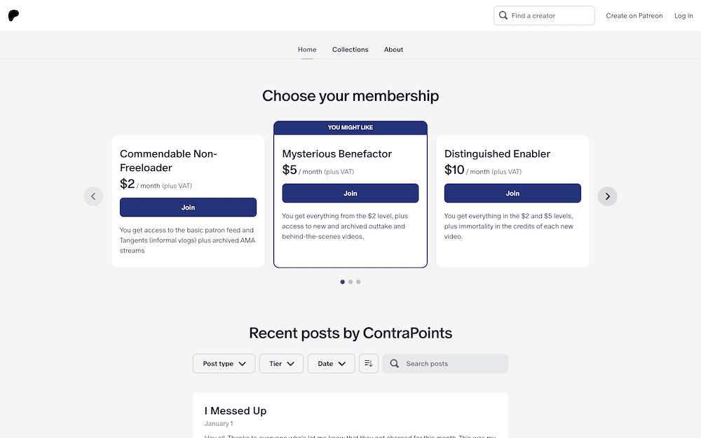
The site provides creators with a platform to monetize content through recurring memberships. It offers the ability to create personalized content tiers, and this often involves direct engagement between creators and patrons.
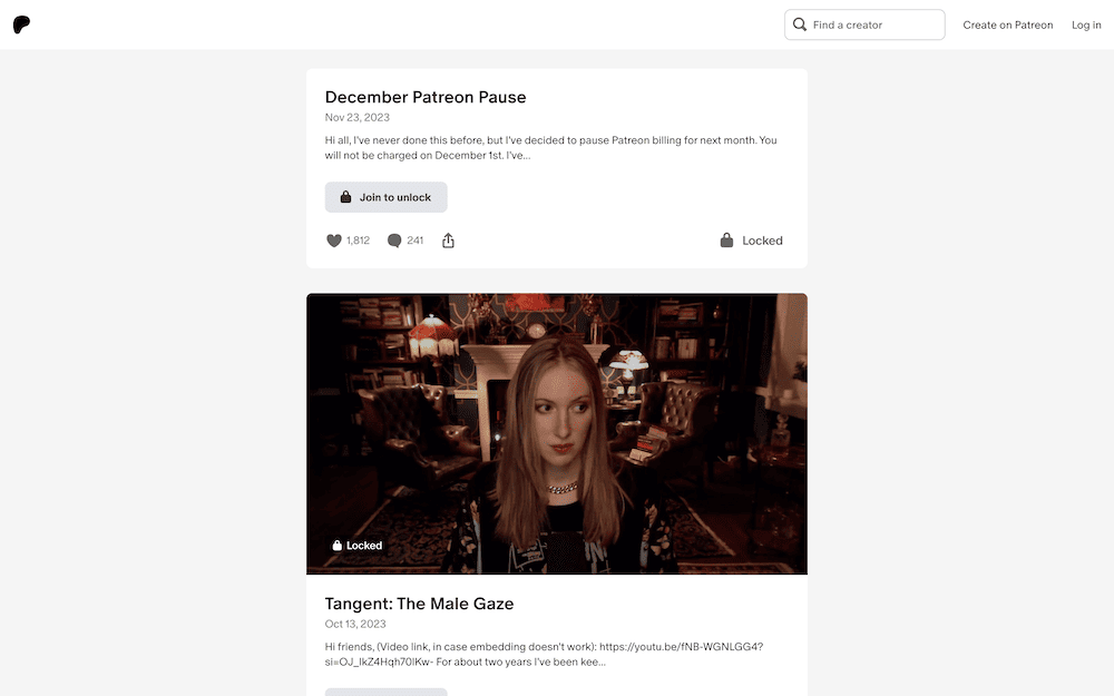
However, Patreon could stand to offer greater customization to help creators develop unique brand identities. WP User Manager is ideal for this approach, thanks to its Content Restriction and Groups add-ons. With the Custom Fields add-on, your members would have even more scope to personalize profiles.
Skillshare is one of many online learning communities that offer a wide range of creative courses and collaborative projects.

Its strength lies in its community engagement, which feels like a bonded class group at times. However, Skillshare’s navigation and UX suffers due to the volume of content on offer. For your site, WP User Manager’s Groups again will be vital as will security implementations to secure and protect user data.
Amazon’s Audible offers an extensive library of audiobooks and podcasts, along with a seamless listening experience and personalized recommendations.

As you’d expect from an Amazon site, it excels in conversion optimization. However, Audible could enhance its community features through a greater integration with its Goodreads brand to let members discuss and review titles.
If you use WP User Manager, its Stripe Pro integration will let you take payments in safety without transaction fees. What’s more, you could implement Likes functionality, and integrate with a plugin such as BuddyPress to ramp up the community engagement options.
That’s a Wrap!
Membership websites can be the answer if you want to develop a profitable and engaging online platform. However, the saturation of free content and the task of capturing and retaining an audience poses real obstacles. It means you need to plan out your strategy, consider the competition, and provide genuine value to members.
Features and functionality such as personalized experiences, content access controls, and interactive community elements will be the bedrock of your site. WP User Manager provides almost everything you’ll need to create a membership website, manage users, and streamline your workflow without the need for technical knowledge. Even better, many of these features are available in the free version. Premium plans begin from $149 per year.
Do you have any questions about creating membership websites, and how WP User Manager can slot into your workflow? Ask us in the comments section below!
